


A title sequence doesn’t have to be memorable or inspired. Plenty of great films just roll credits over establishing shots or black. This is why when a title sequence does transcend the norm, it becomes something really special. Think Napoleon Dynamite. Think Star Wars’ scrolling paragraphs. These preambles become part and parcel of the whole film: inseparable from our experience or memory of it. Like all forms of filmmaking, there is no one-size-fits-all answer for what makes a title sequence great. Some are serious, some are playful, some are abstract, some are a lie. Whatever form they take, they enhance our experience and understanding of the film or television show that follows. They make a first impression — they set the stage.
Here are 5 title sequences that pull 10 times their weight.
LORD OF WAR
Despite its outdated CGI, the title sequence for Lord of War (2005) remains one of the most memorable of the past few decades. This three-and-a-half-minute sequence masterfully sets up the world, the tone, the ideas, and the stakes, as we follow a bullet from its creation to its ultimate, tragic purpose. A twist, maybe, on Chekhov’s gun. We all know where the sequence is heading, and our expectations add a sense of tension and menace to an otherwise prosaic manufacturing process. It’s a perfect example of a title sequence that isn’t just a precursor to a story, but a story within itself.
FARGO
It’s hard to imagine a simpler title sequence than the Coen Brothers’ Fargo (1996). It opens with what appears to be a simple housekeeping statement — the now infamous yet blatantly false “This is a true story.” — followed by long shot of a car being towed through a North Dakota white out. It’s not much. It would be hard for it to be less, actually. Yet it completely changes the way you watch this film and, once you learn the truth of it, the way you watch other films. Not bad for a little bit of text and a beat-up Oldsmobile.
MONSTERS, INC.
In stark contrast to the lush, computer-animated, 3D world of Monsters, Inc. (2001), its title sequence is flat and hand drawn: a jazzed-up throwback to the early days of traditional animation. While plenty could be said for its design, tone, and execution, the best thing about this sequence is that it’s just so fun to watch: consistently whimsical, clever, and — most importantly — surprising. It also served an important utilitarian function: reminding kids not to be afraid. Before Pixar decided to include the sequence, the film started with a cold open inside the “Scare Floor.” The scene was purposefully meant to contrast the lighthearted, totally not scary nature of the rest of the film; but kids were getting spooked, and the film was getting bad prescreening reviews. Including this brilliant little title sequence helped put the audience at ease from the get-go and established the true tone of the film to follow.
MAD MEN
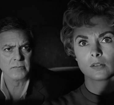
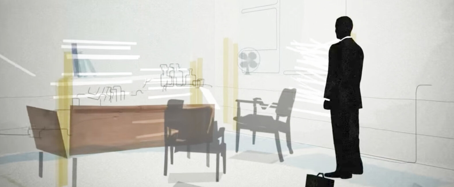
“I imagine a guy walking into a building, taking the elevator up to his office, putting his briefcase down and jumping out the window…but not that.” So went show creator Matthew Weiner’s creative direction regarding the Mad Men title sequence. And what do you know? Throwing a guy out a window is exactly what they did. “I thought, Why NOT that?” title designer Steve Fuller told Print Magazine. The result is one of the most iconic title sequences in modern television history. A suicide juxtaposed against a billboard backdrop. A saccharine sweet, Technicolor world contrasted with a monochromatic man. The message here hints at the duality of the show’s characters and world: the emptiness of those who create desire. Just like in advertising, what you see is rarely what you get.
THE TWILIGHT ZONE
This gloriously cheesy, practically executed, strangely compelling title sequence has stood the test of time. It’s strange. Kind of unnerving. You don’t exactly want to watch it, and yet you don’t want to look away — much like the show itself. This sequence functions like a weirdo overture, getting the viewer into The Twilight Zone headspace before plunging them into that week’s episode. Sometimes there’s nothing wrong with being completely on the nose, telling people exactly what you want them to know.